How do I use Components in Webforms?

BoothBook
Last Update 3 years ago
What are Components?
Components are used to create the building blocks for your form/questionnaire. These are broken up into many different types. i.e. Text field, Email address, check boxes, date and so on...
- You can set any of your components as a required/non required field.
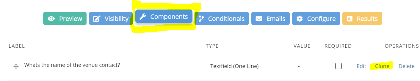
- You can clone your components at any point by going to your components dashboard for a webform.
Component Types
See examples and information below for each of our component types:
- Text field (one line)
This is a great component for simple question/answer responses and will most likely be the most popular as it can be used for various scenarios.
E.g.
Q: What's the name of the venue contact?
A: Sarah Jones - Event Coordinator
- Text area (multiple lines)
You may want to use this type when asking broader questions where you'd like more in depth answers/feedback.
E.g.
Q: Please leave us any feedback which could help us with future events
A: You were great and all of our guests loved you! The only thing I would say is it felt like you were rushing during the set up so it would have been better if you arrived slightly earlier. Thanks again for your professional and friendly service though, would highly recommend you to others!
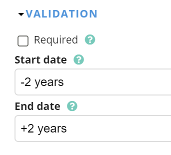
- Date
You have the choice to make this field a drop down list with a manually year entry AND/OR a pop up calendar.
You can also control the earliest and latest date entry from 'today's date. See below.
E.g.
Q: When would you like the gallery posted?
A: 4th Sep 2019
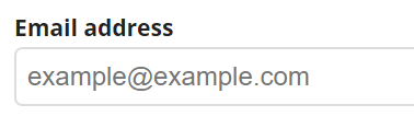
Simply requesting the customer to add an email address in. This will not be accepted if it doesn't include an '@' in the field. A nice touch would be to add a place holder, see below. Or you can choose to set the customers email as a default, if BoothBook has access to it at the time of filling out the form.
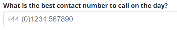
- Telephone
You can add a placeholder in the value box to ensure customers input the phone number format correctly. See the example below:
- Time
If you set the default time to 'now' it will automatically pull through the customer's local time.
You can also set whether you'd like them to set the time to a 12hr or 24hr clock from a drop down.
If you want to restrict the time they choose to specific time bands, you can do this by setting your minute increments to 15 minutes for example, which will only allow them to select 11:00/11:15/11:30 etc.
E.g.
Q: What time does your venue close on the event date?
A: 12:00am (12hr) / 00:00 (24hr)
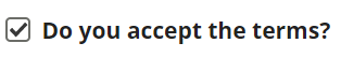
- Checkbox - can be multiple boxes/make required
You can make check boxes required, for example, if it is a legal requirement.
E.g.
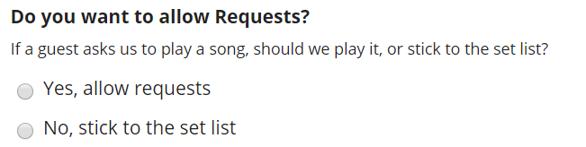
- Select Options
You can use this for various questions. You can personalise your options by manually adding more than 1 answer, or you can add a pre-built list for your answers (e.g. days of the week, US countries, US states)
- If you wish to have a drop down list instead of checkboxes, select 'listbox' in the display section.
- Set the permissions where a customer can choose multiple options or a single.
E.g.
- Number
You can be flexible with this as you can use number for many scenarios. Here are a few options you have when setting up this component:
- Ensure the value is an integer (no decimal points)
- Set a min & max amount
- Set a specific increment. For example the customer can choose from a drop down from steps of 5 (5,10,15,20 etc)
- Option to add a prefix before of after the value e.g. £20 or 5%
- Decimal place positioning
E.g.
Q: How many guests will be at your event?
A: 80 (an integer value)
- File
There are many files extensions you can use, depending on the purpose. For example, for an image it would look like this to the customer:
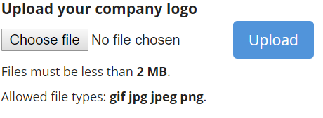
You can maximise your file sizes too. A recommended amount would be max 2MB.
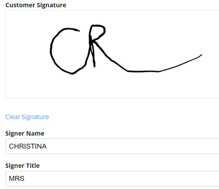
- E-Signature
Add this to the end of your webform for the customer to sign. In doing so, this helps the accountability of your booking relating to any questions in the completed form.
- Choose if you want the signer name and title to be shown on the webform below the signature field.
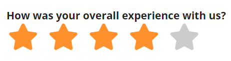
- Star Rating
The set up is very simple with this component. You only need to add the label (question) and it will automatically pull through the stars on the form for the customer to select. See below:
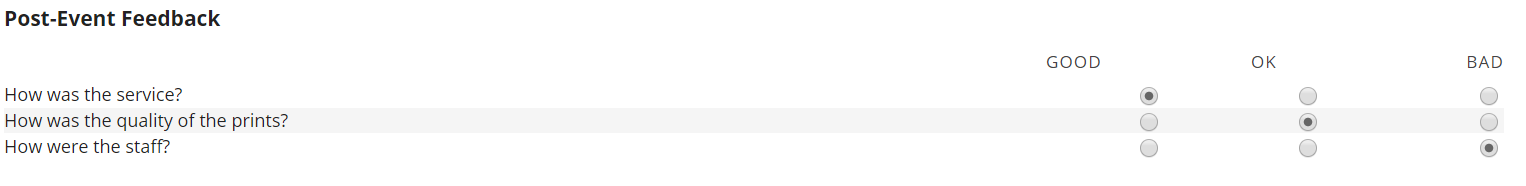
- Multiple Option Survey - various display options
E.g.
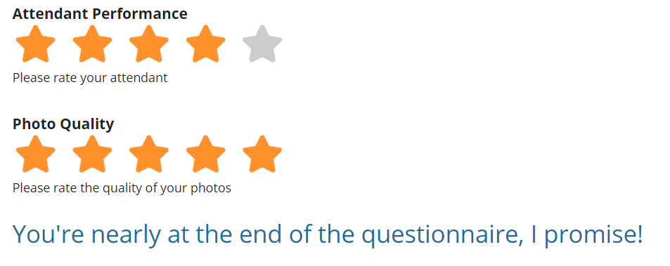
- Inline Description (markup)
This component can be used to place comments, tips, encouragement (it can be a long ordeal!) for the customer to see at points during the webform. For example, "You're nearly at the end of the questionnaire, I promise!"
When creating, make sure you add your description into the value box and format it as you wish ie. heading 2 in bold font. Once you have set up your component, drag the inline description to the location you wish on your component dashboard.
Steps to add Image on your Webform
Step 1: Add a new component to a webform of the type "Inline Markup"
Step 2: On the next page, click "switch to plain text editor" so you can add html
Step 3: Add in the code for an image in html
Step 4: Save
Once you have created this component, you can drag it into the appropriate location on your components dashboard.
You can also add conditionals to markups, for example, if the customer selects a specific answer, you can automate a markup to say '"Great choice! We think so too!" Find out more about using conditionals in Webforms here.
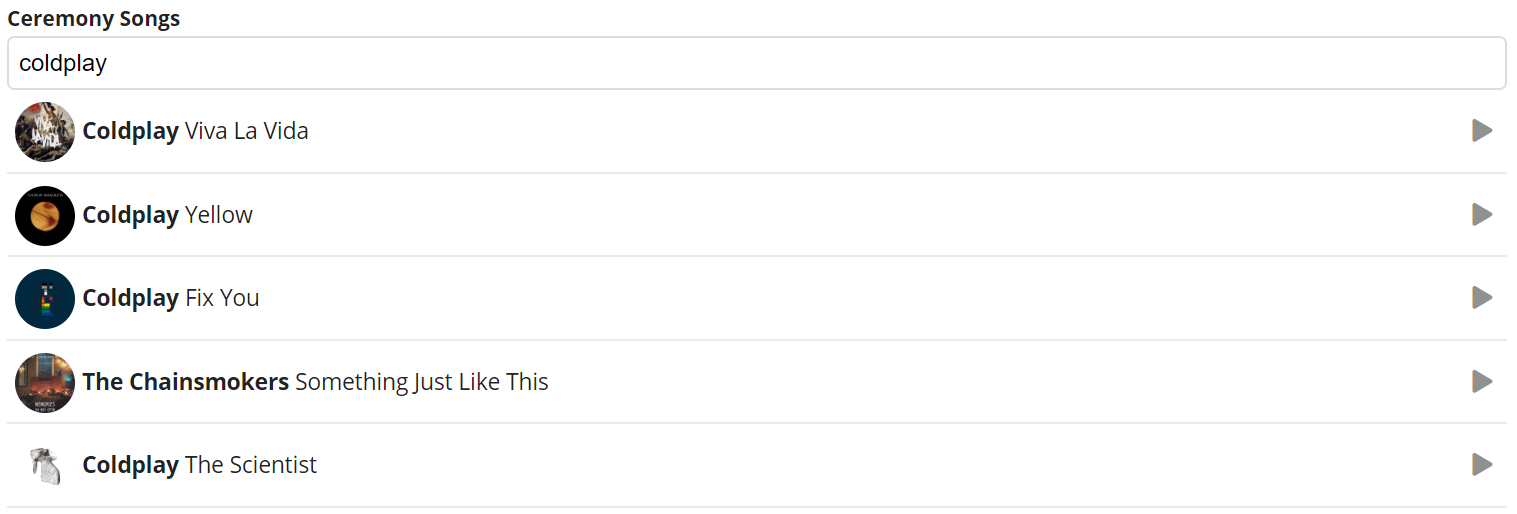
- Song Choice
This is a great sought after feature for DJ's especially as it allows their customers to create a playlist for the ceremony, first dance or disco with their preferred song choices. The search function brings up the song/artist as you begin typing, the album cover and (almost) all of them allow you to preview the song - amazing!
If you would rather the customer typed in their song requests, we would recommend using the 'text area' component instead. Be aware they may request unknown songs which you may have to confirm with them.
Watch the below video to see how to set up a song choice, as well as testing the customer facing page.
The below components are for webform sets ups and page presentation, rather than customer questions.
- Field Set (group)
The field set component is a great tool when you want to separate your webform into sections. It separates those questions into a box to make it visibly clear for the customer to answer. You can also add a description as an explanation. See below:
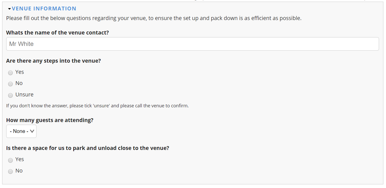
Once you have created a field set, you will need to drag it above all related questions and make sure the questions are indented so they sit within the Field Set on the main components page.
Watch the below video where it demonstrates how to add a field set to a group of existing components.
Some other examples of Fields Sets could be:
- Pre-Event Information
- Post Event Information
- Wedding Music
- Feedback
- More Info
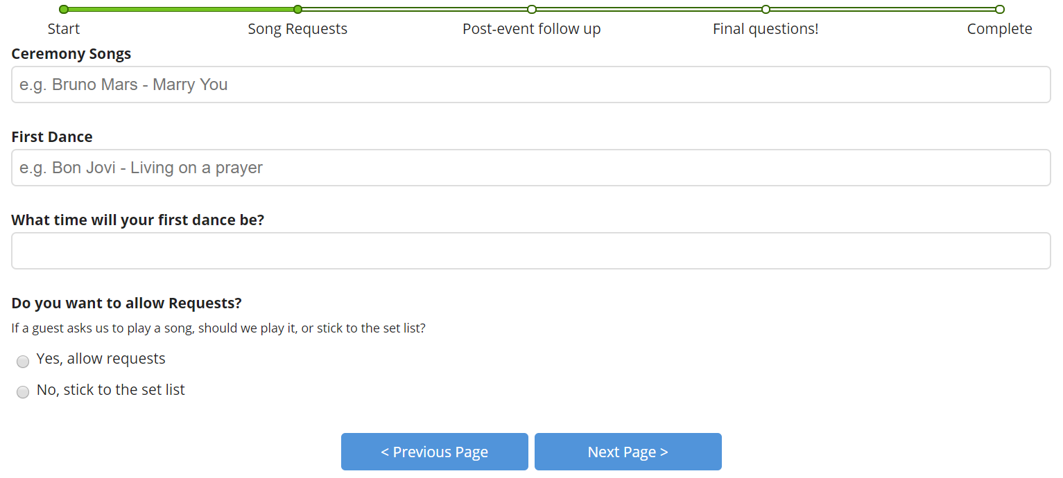
- Page Break
This concept is similar to the Field Set component however rather than separate the questions into a box on the same page, it splits up the pages completely into steps.
Below you can see it displays a progress bar (optional) as well as next and previous buttons (can be personalised).
Visually this is a more presentable component and also helps guide the customer through the webform.
Watch the below video where we demonstrate how to add in a simple page break to your webform.
Click here to watch the beginning to end process of creating a webform.